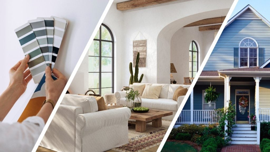
Selling a home isn’t just about square footage and staging. Color does quite a bit of heavy lifting—especially in competitive, coastal-adjacent markets like Torrance and Manhattan Beach. The right interior paint scheme makes spaces feel bigger, brighter, cleaner, and more move-in ready. Below, you’ll find a strategic, room-by-room guide tuned to local light, buyer expectations, and the ways open-plan homes photograph in listing photos and videos.
If you’d like expert color sampling and a one-and-done finish before photos, our team can handle it end to end through our Interior Painting service. And if you’re targeting buyers in Manhattan Beach specifically, explore our local page for painters there.
Why Neutral Wins When You’re Listing
Neutrals lead because they:
- Lend a clean, move-in-ready feeling that buyers trust.
- Photograph consistently across phones, DSLR cameras, and twilight shoots.
- Bridge varied flooring (oak, tile, carpet) and mixed finishes.
- Give stagers a flexible backdrop for art and textiles.
The goal isn’t to erase character—it’s to create a calm baseline that helps buyers imagine themselves living there without mental “repaint” math.
Local Light Matters: Torrance vs. Manhattan Beach
- Torrance: Many homes have balanced daylight with pockets of shade from mature trees and neighboring structures. Crisp but soft neutrals keep rooms open without reading cold on overcast mornings.
- Manhattan Beach: Homes closer to the water can get stronger glare and cooler morning light. Colors with a touch of green or greige undertone stay even as daylight shifts and as the ocean influence cools hues.
Undertones 101 (Fast)
When in doubt, think in undertones:
- Greige (gray + beige): crowd-pleasing, stable in photos, forgiving over mixed flooring.
- Green-gray: balances glare, ideal for bright spaces and west-facing rooms.
- Warm oat/soft beige: adds lift in shaded rooms and halls; avoids starkness.
- True cool gray: use sparingly; can feel chilly if your listing photos skew blue.
- Soft white: safest overall—but the right undertone is crucial (slightly warm in shade, slightly green-gray where glare is strong).
Sheen Strategy That Sells
- Walls: high-quality matte or eggshell. Matte hides minor wall texture and photographs softly; eggshell is easy to clean and handles foot traffic.
- Trim/Doors: satin for crispness without excessive shine.
- Cabinetry/Built-ins: satin or semi-gloss for durability and wipeability. If cabinets need a refresh before the market, our Cabinet Painting service can make a dramatic difference.
A Simple, Sale-Ready Whole-Home Palette
Aim for one main wall color throughout, plus two strategic accents where useful:
- Main neutral (60–70% of walls): a balanced greige or softened white that stays steady in different rooms.
- Secondary neutral (20–30%): a slightly warmer tone for shaded areas or bedrooms that need coziness.
- Accent (≤10%): optional; use on a fireplace, built-ins, or a small dining niche. Keep it subtle and sophisticated—no high-contrast novelty.
Room-by-Room Recommendations (Optimized for Listing Photos)
Living Room / Great Room
- What works: a light greige or soft white with a hint of green-gray undertone. This helps with afternoon glare and keeps sofas, rugs, and art looking intentional in photos.
- Why buyers like it: feels airy, move-in ready, and modern without tipping into stark gallery vibes.
- Pro tip: keep ceilings the same family, one notch lighter, to visually raise the height in photos.
Kitchen
- What works: continue the main neutral to unify with the great room. If cabinets are darker or warm-toned, pick the neutral that complements those tones rather than fighting them.
- If cabinets are tired, repainting them in a soft white or greige—paired with a clean satin finish—can transform the space’s perceived value. Our Cabinet Painting team can advise on tone and sheen.
Dining Area
- What works: the same neutral as the great room, or a whisper-deeper tone for definition in open plans.
- Staging angle: a slightly darker neutral on a single niche or built-in adds depth without looking theme-y.
Bedrooms
- What works: soothing, mid-light neutrals that read warm in the morning and evening.
- Buyer psychology: bedrooms feel more restful when the wall color doesn’t reflect a blue cast at night; favor neutrals with a controlled warm undertone.
Bathrooms
- What works: soft, clean neutrals that flatter skin tone in listing photos. Avoid icy whites that can make tile feel cold.
- Sheen: moisture-tolerant eggshell or durable matte; satin for trim/vanities.
Hallways & Transitional Spaces
- What works: carry the main color through to elongate sightlines and reduce visual stops.
- Why it sells: continuity makes homes feel larger and more upscale.
Palette Blueprints by Exposure
- North-facing rooms (steady, cool light): warm greige or oat neutrals keep walls from going flat.
- East-facing (cool morning): soft whites and greige that don’t turn icy at 8 a.m.
- South-facing (warm, abundant light): neutral with faint green/gray undertone to prevent yellowness.
- West-facing (afternoon glare): green-gray or driftwood-leaning neutrals help maintain composure.
The Three-Sample Test (Save Time Before Photos)
- Your best-guess neutral.
- The same depth, slightly warmer.
- The same depth, slightly greener/greige.
Paint 2’ x 2’ swatches on two walls per space (one facing the windows, one opposite). Review in the morning, at noon, and at twilight—exactly when listing photos or showings are likely to occur. Most sellers land on the slightly greener greige because it stays stable across cameras and times of day.
Trim, Doors, and Ceilings—The Finishing Touches
- Trim: a softened white in satin sharpens edges against neutrals without a harsh jump.
- Interior doors: the same trim, white, or one step deeper for subtle architectural interest.
- Ceilings: keep in the wall color family but lighter by a shade or two; the effect is good without stark contrast, which photographs better.
Open-Plan Cohesion for Manhattan Beach & Torrance Homes
Open plans are common locally. One calm wall color flowing from entry to living to kitchen says “spacious” in photos. Where you need separation—around a fireplace, a built-in TV, or a banquette—a gentle step deeper into the same color family gives structure without chopping up the layout.
When an Accent Helps (And When It Hurts)
- Helps: a mid-depth neutral on a fireplace wall, built-in, or bar niche can add value cues and photo depth.
- Hurts: high-contrast statement walls, especially saturated blues or charcoals, can narrow perceived space and limit buyer imagination. Keep accents low-chroma and refined.
Flooring & Fixed Elements: Matching, Not Fighting
- Light oak/engineered oak: choose a greige that bridges warm wood and cool light.
- Tile (beige or travertine): pick a neutral with a whisper of warmth, so grout lines don’t pop.
- Gray tile or cool stone: lean slightly warmer on the walls so the room doesn’t drift cold in photos.
- Carpet: Stay one to two steps lighter than the carpet to avoid a muddy, heavy feel.
Staging Synergy: Make Your Color Choice Work Harder
- Window treatments: light, textured weaves soften glare without blocking light.
- Rugs: low-contrast patterns photograph best; they make rooms feel larger.
- Metals: brushed nickel or warm brass hardware pair easily with modern neutrals.
- Art & pillows: keep the contrast moderate; let buyers focus on the space, not just the décor.
Fast Fixes Before You List
- Patch, sand, and caulk: small imperfections read louder in high-res photos; paint won’t hide texture.
- Prime glossy areas to prevent flashing and uneven sheen.
- Consistent sheens: don’t mix multiple wall sheens; photos will show every change.
- Cabinet refresh: painting dated cabinets is often the highest-ROI color move you can make pre-listing.
How Cooley Brothers Streamlines Your Pre-Sale Repaint
- Walkthrough & plan: align colors with your agent’s strategy and your timeline.
- Sampling: targeted swatches placed where photos will be taken.
- Prep: repairs, masking, and surface cleaning for crisp edges.
- Application: brush/roll methods tuned to the paint and sheen so walls look uniform in person and on camera.
- Detail pass: trim lines, door edges, built-ins, and touch-ups under multiple lighting conditions.
- Final check: daylight and artificial light review to ensure your neutral reads right in every room.
If you want help getting market-ready quickly, start with Interior Painting. For Manhattan Beach homeowners, our local crew details are here: painters in Manhattan Beach.
Sample Whole-Home Schemes (Buyer-Approved Vibes)
- Bright Coastal Calm: soft white walls, softened white trim, pale greige built-ins; perfect for light-filled Manhattan Beach living rooms.
- Modern Greige Flow: mid-light greige walls, same-family lighter trim, deeper greige on a fireplace for subtle depth.
- Warm Welcome: oat-leaning neutral in shaded halls and bedrooms, greige in the main areas for continuity, satin white trim to sharpen lines.
- Refined Driftwood: green-gray walls in west-facing rooms, tone-on-tone trim, and a fractional step deeper on the media wall to anchor furniture.
Common Mistakes That Slow a Sale
- Choosing a trendy dark accent in a small room that shrinks the space on camera.
- Using a crisp, cool white everywhere that turns sterile in coastal glare.
- Mixing gloss levels across continuous walls, which looks patchy in listing photos.
- Leaving old touch-up patches unprimed—flash spots are obvious in person and online.
- Jumping between multiple neutrals in an open-plan space chops up sightlines and confuses buyers.
Torrance vs. Manhattan Beach: Quick Nuance Guide
- Torrance sellers: aim for a slightly warmer neutral in shaded rooms and hallways. It brings life to spaces that won’t always be photographed in peak daylight.
- Manhattan Beach sellers: choose a neutral with a dash of green-gray to tame glare and maintain color accuracy in bright, ocean-influenced light.
Timeline Tips: When You’re Racing the Market
- Two weeks before photos: finalize color and schedule painting.
- 7–10 days out: complete painting so freshly painted rooms can air out and settle.
- 48–72 hours before photos: deep clean, stage, and check how the color reads at the exact time your photographer is booked.
FAQ
1) What interior color helps homes sell fastest?
A balanced greige or a soft white with controlled warmth. Both show well in photos, appeal to the broadest buyer pool, and make rooms feel larger.
2) Should I paint every room the same color?
Using a single main neutral throughout open areas, with the option for a slightly warmer tone in bedrooms or shaded halls, creates continuity and a sense of size without feeling monotonous.
3) Which sheen is best for walls when listing my home?
Durable matte or eggshell. Both minimize wall texture while looking clean in photos; eggshell adds easy maintenance for showings.
4) Are accent walls a good idea before selling?
Keep accents subtle. A gentle step deeper in the same color family on a fireplace or built-ins adds value cues without polarizing buyers.
5) Is repainting kitchen cabinets worth it?
Often yes. Freshly painted cabinets in a soft white or greige modernize a kitchen at a fraction of the cost of a full remodel, which can lift perceived value and shorten days on market. Our Cabinet Painting service handles color, prep, and durable finishes.

David Cooley, the esteemed owner of Cooley Brothers Painting, has established himself as a leading figure in the painting industry. With a rich history of delivering unparalleled service in Torrance, Manhattan Beach, Palos Verdes Estates, Redondo Beach, and Rolling Hills, his hands-on approach and dedication to quality have shaped Cooley Brothers Painting into a trusted name for exceptional painting services. With a focus on innovation, customer satisfaction, and community engagement, David’s leadership continues guiding his team toward new heights of excellence and reliability in every project.