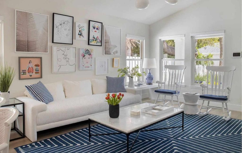
Designing a coastal living room in Palos Verdes Estates isn’t just about picking a “beachy blue.” It’s about reading the light, balancing ocean views with architecture, and choosing finishes that stand up to salt air and day-to-day wear and tear. Here’s a practical, local-first guide from Cooley Brothers to help you dial in a living room palette that looks gorgeous at sunrise, stands up to afternoon glare, and still feels calm after dark.
(If you’d like professional help painting your living room, our Interior Painting team can handle color sampling, prep, and a flawless finish. For Palos Verdes Estates homeowners, you can also explore our Palos Verdes Estates painters page.)
Why “coastal” looks different in Palos Verdes Estates
Soft neutrals, surf-inspired blues, chalky whites, and light woods often define coastal style. In PVE, the microclimate and hillside placement mean your living room might get strong, slanted light for part of the day and cool, fog-tinted light at other times. That swing changes how color reads on your walls.
- Morning light (east-facing): paints look cooler and crisper. Whites skew icier; blues feel a touch grayer.
- Midday light (south-facing): brighter and warmer; off-whites can bloom yellow if undertones are too warm.
- Afternoon glare (west-facing): saturated hues can feel intense; neutrals with green/gray undertones hold better.
- North-facing: consistent but cool light; you’ll want colors with a hint of warmth to avoid looking flat.
Five coastal directions (and the rooms they suit)
Think of coastal palettes as “directions.” Pick one that matches your room’s natural light and architecture.
- Salt-White & Sand Neutral
- Use when: You have great views, textured furnishings, or statement art.
- Why it works: Enhances light, lets materials sing (linen, jute, oak).
- What to watch: Too cool can feel sterile; too warm can look creamy under PVE sun.
- Sea Glass Blues & Blue-Greens
- Use when: You want a calm, spa-like backdrop that still has character.
- Why it works: Soft chroma pairs with coastal greenery and ocean tones.
- What to watch: Green-leading hues can shift with afternoon sun.
- Mist Grays & Weathered Driftwood
- Use when: You get harsh west light; you need a color that stays even.
- Why it works: Gray with a drop of green keeps glare in check.
- What to watch: Gray that’s too cool can feel chilly on foggy mornings.
- Warm Oat & Pale Wheat Neutrals
- Use when: North or shaded rooms need a lift without stark white.
- Why it works: Adds quiet warmth; pairs with natural stone and woven textures.
- What to watch: Avoid strong yellow undertones that spike at midday.
- Coastal Charcoal Accents
- Use when: You want depth on a fireplace wall, built-ins, or window trim.
- Why it works: A moody swing anchors light palettes and frames the view.
- What to watch: Keep the sheen low to prevent glare.
Undertones 101: the secret to a calm coastal room
Two whites can look identical on a swatch but wildly different on your wall. That’s undertone. In PVE’s changing daylight, undertones make or break a coastal scheme:
- Blue undertone: crisp and cool; can turn steely under fog.
- Green undertone: balances glare; feels natural with palms and outdoor greens.
- Violet undertone: can calm yellow light, but may read “cool gray” later.
- Red/yellow undertone: warms up north rooms; watch for creaminess in the afternoon.
Tip: sample two related neutrals side by side—one slightly greener, one slightly grayer. The greener option often behaves better through PVE’s golden hour.
Sheen matters (a lot) in bright coastal spaces
Sheen controls how light bounces. In bright living rooms with open windows, the wrong sheen amplifies every ripple.
- Matte/Flat: beautiful, soft, and hides texture; choose durable, scrubbable formulas.
- Eggshell: a safe go-to for living rooms—subtle glow without the glare.
- Satin: great for trim or built-ins; can look shiny on large walls in strong light.
- Semi-gloss: best reserved for trim/doors; can feel reflective in rooms with ocean-facing windows.
Our Interior Painting crews can advise on the sheen based on wall condition and traffic level.
Natural light playbook: choose by exposure
Use this quick map to select a direction based on your room’s strongest exposure.
- North-facing living rooms:
- Palette: warm oat, pale wheat, soft greige.
- Undertone: a touch of red/yellow to counter cool light.
- Sheen: eggshell for lift; matte for extra softness.
- East-facing living rooms (morning light):
- Palette: soft sea glass, gray-blue, salt-white.
- Undertone: blue-green to avoid going icy.
- Sheen: matte/eggshell to avoid crispness turning clinical.
- South-facing (consistent warm light):
- Palette: true whites, airy neutrals, mist gray.
- Undertone: green/gray to offset warmth.
- Sheen: eggshell; keep trims satin for contrast.
- West-facing (afternoon glare):
- Palette: driftwood gray, sage-gray, coastal charcoal accents.
- Undertone: green/neutral to keep color steady.
- Sheen: matte/eggshell; avoid sheen jumps.
The “three-swatch” method (PVE edition)
Coastal rooms reward restraint. Instead of grabbing a dozen samples, try three targeted swatches:
- Your hero neutral (the wall color you think you want).
- A cooler neighbor (same depth, slightly cooler undertone).
- A greener stabilizer (same depth, a whisper of green).
Paint 2’ x 2’ squares on two walls—one facing the main light source and one opposite. Look in the morning, midday, sunset, and at night. In PVE, many homeowners choose the “greener stabilizer” because it performs well throughout the day.
Pairing with flooring, stone, and ceiling tints
Coastal palettes feel best when they’re tuned to the materials already in your space.
- Light oak or white-oak floors: lean into salt-white walls and warm oat accents; avoid stark blue-white whites.
- Travertine, limestone, or creamy marbles: choose warm neutrals with soft gray or green undertones.
- Slate or bluestone fireplaces: embrace sea-glass blue-greens or driftwood grays.
- Ceiling tints: at 75–85% of your wall white, can soften transitions; in rooms with strong sun, keep ceilings in the same family but a touch cooler to prevent “glow.”
Accent ideas that still feel coastal
You don’t need navy stripes to feel beachy. Try these living-room-specific ideas:
- Built-ins: Use a soft driftwood gray on cabinet faces, with satin on shelves for wipeability.
- Fireplace wall: a coastal charcoal or deep blue-green grounds pale furniture.
- Window trim: slightly darker neutral than walls to frame landscape views.
- Back of shelving: sea-glass tint to make ceramics and books pop.
- Entry pass-throughs: continue wall color using a lower sheen for softness, keeping sightlines calm.
(If your “accent” is cabinetry or a media wall, our Cabinet Painting service delivers crisp lines and durable finishes that won’t yellow.)
A sample palette map for common PVE scenarios
Scenario A: Bright south light + ocean glimpse
- Walls: salt-white with a green-gray undertone.
- Trim/Doors: crisp white in satin.
- Built-ins: mist gray in satin.
- Textiles: flax linens, pale blue pillows; one woven jute rug.
Scenario B: West light, strong afternoon glare
- Walls: driftwood gray (medium-light value) with green undertone.
- Trim: same hue, one shade lighter for a tone-on-tone look.
- Accent: coastal charcoal on fireplace surround.
- Metals: brushed nickel or aged brass for a softer finish.
Scenario C: North-facing, shaded by landscaping
- Walls: warm oat neutral with mild red undertone.
- Ceiling: same color at 80% strength for lift.
- Accent: soft blue-green on backs of built-ins.
- Textiles: wool throws in sandy cream; light wood side tables.
Scenario D: Open-plan with stone floors
- Walls: pale greige that bridges warm stone and cool daylight.
- Trim: not bright white—use a slightly softened white to avoid stark contrast.
- Accent: sea-mist blue on one architectural niche.
Texture, art, and furniture: keeping the coastal thread
Color is the backdrop. Texture and materials carry the mood:
- Woods: white oak, drifted ash, teak with a matte finish.
- Metals: brushed nickel, unlacquered brass, blackened steel (sparingly).
- Textiles: linens, cotton, chunky knits, sisal/jute.
- Art: photography with horizon lines, abstract ocean palettes, or ink drawings.
- Plants: olive trees, palms, or rubber plants to echo outdoor greens.
When walls are quiet and airy, you can layer more texture without visual noise.
Practical durability: living rooms that are actually lived in
Coastal spaces should be beautiful—and easy to maintain.
- Washable matte or high-quality eggshell finishes keep walls calm but still cleanable.
- Satin on built-ins and mantels resists scuffs from books and décor.
- Entry transitions: consider a half-wall in the living room tone near the door to hide scuffs, or a micro-accent in the same family but slightly deeper.
Suppose you’re considering a floor refresh in your living room’s vicinity (like a garage entry or studio). In that case, Epoxy Floor Coatings can create a clean, sand-resistant transition that won’t compete with your living room palette.
How we run a living room repaint in PVE (step by step)
- Walkthrough & light study: we check exposure, glazing, and view lines.
- Sample placement: 2’ x 2’ swatches on two walls; we review at four times of day.
- Surface prep: patch, sand, caulk, and mask for crisp lines.
- Prime (as needed): especially over previous high-sheen or stained areas.
- Brush/roll application: tuned to sheen and substrate for a uniform finish.
- Detailing: clean edges at ceilings, baseboards, and windows.
- Final check: view at sunset and evening lighting to confirm undertone behavior.
Ready for a smooth, professional result? Our Palos Verdes Estates painting team can schedule an on-site consult.
Common pitfalls (and how to avoid them)
- Choosing a stark “gallery white” everywhere: it can go cold and clinical against ocean light. Add a whisper of warmth or green.
- Picking a blue that’s perfect at noon—then moody at 6 pm: test at multiple times; consider a bluer-in-name, greener-in-undertone color.
- High-sheen walls in west light: highlight roller marks and texture; use eggshell or matte.
- Bright white trim with very warm walls: can look mismatched; choose a harmonious, softened trim white.
- Skipping primer over patched areas leads to flashing—visible dull spots under the coastal sun.
Styling the final 10%: pulls, lamps, and shades
- Lamp shades: natural linen or paper to diffuse PVE’s bright afternoons.
- Hardware: aged brass feels warm; brushed nickel ties to sea-glass tones.
- Rugs: choose a sandy base with a subtle pattern; avoid high-contrast stripes if you already have textured walls or stone.
- Window treatments: light-filtering woven shades soften glare without blocking the view.
Ready-made color pairings to test (by vibe)
- Airy Gallery: salt-white walls / softened white trim / pale gray built-ins.
- Sea Breeze: blue-green walls / white oak accents / crisp white trim.
- Cliffside Calm: driftwood gray walls / coastal charcoal fireplace/flax textiles.
- Sun-Softened: warm oat walls / 80% ceiling tint/stone fireplace in soft gray.
Working with Cooley Brothers
We’re local, so we know how PVE daylight and fog flirt with undertones—and we plan for it. From sampling and prep to final brushwork, our aim is a living room that feels calm at breakfast, serene at sunset, and inviting for guests.
Explore Interior Painting for full details, or request a visit through our Palos Verdes Estates service page.
FAQs
1) What’s the best white for a coastal living room in PVE?
Choose a white with a soft green-gray undertone to handle warm midday light without going icy in the morning. Always sample on two walls and check it day and night.
2) How do I keep a blue from feeling too bright at sunset?
Favor blue-greens or grayed blues. The green content steadies color under glare. Test in late afternoon and evening before committing.
3) Which sheen is best for living room walls?
A high-quality eggshell is a safe choice—washable without reflectivity. If your walls are textured, try a durable matte for a softer coastal look.
4) Can I paint the fireplace wall darker without losing the coastal feel?
Yes. A coastal charcoal or broad blue-green accent can anchor the room—especially with pale textiles and light wood to keep the balance.
5) Do I need to repaint the trim if I change the wall color?
Not always, but consider it. Trim in a softened white (not stark bright) often creates a smoother transition with coastal neutrals.

David Cooley, the esteemed owner of Cooley Brothers Painting, has established himself as a leading figure in the painting industry. With a rich history of delivering unparalleled service in Torrance, Manhattan Beach, Palos Verdes Estates, Redondo Beach, and Rolling Hills, his hands-on approach and dedication to quality have shaped Cooley Brothers Painting into a trusted name for exceptional painting services. With a focus on innovation, customer satisfaction, and community engagement, David’s leadership continues guiding his team toward new heights of excellence and reliability in every project.