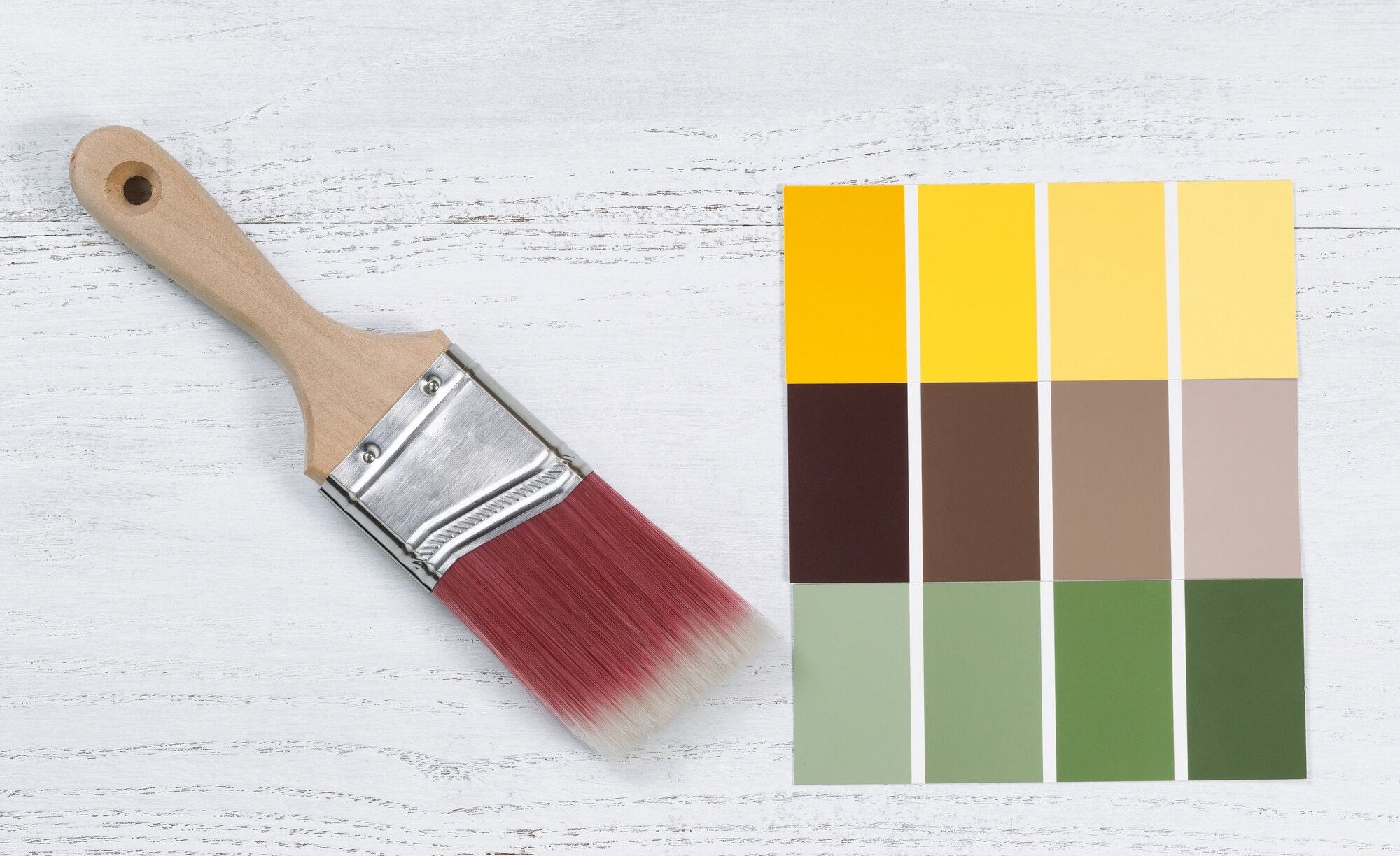
How do I choose commercial paint colors for my Manhattan Beach business?
Your building’s color is often a customer’s first impression. Here’s what you’ll learn: how commercial paint colors influence perception, how to align them with your brand, and how to choose shades that work in Manhattan Beach’s coastal setting. (This guide is written for business owners and property managers.)
The best commercial paint colors in Manhattan Beach reinforce your brand identity while fitting the coastal, upscale setting. Color shapes how customers feel about your business before they walk in — trust, energy, calm, or premium quality. The right palette balances your brand colors, your industry, local expectations, and durable coatings built for the coast.
Cooley Brothers Painting works with homeowners across Manhattan Beach. Meet our painters in Manhattan Beach.
Why do commercial paint colors matter?
Color is a silent salesperson. Studies of consumer behavior consistently show that color drives a large share of first impressions and snap judgments about a business. For a storefront, office, or restaurant, the exterior and interior palette signals your personality — modern or traditional, energetic or calming, budget or premium — before a single word is exchanged.
In a design-conscious market like Manhattan Beach, that impression carries real weight. A thoughtful color scheme can make a business feel current, trustworthy, and worth visiting.
What do common brand colors communicate?
Each color family sends a message. Use this as a starting point:
| Color | Commonly signals | Fits |
|---|---|---|
| Blue | Trust, calm, professionalism | Offices, medical, finance |
| Green | Health, growth, sustainability | Wellness, organic, outdoor |
| Black/charcoal | Luxury, sophistication | Boutiques, salons, premium retail |
| White/neutral | Clean, modern, spacious | Coastal, minimalist, galleries |
| Warm tones | Energy, appetite, welcome | Restaurants, cafes, fitness |
How do you match paint colors to your brand?
Start with your existing brand identity. Pull the colors from your logo, signage, and website so the building reinforces the brand customers already recognize. Then adapt them for architecture: a bold logo color often works best as an accent — on the door, trim, or a feature wall — with a neutral base carrying the bulk of the space.
Understanding the meaning behind color choices helps you use them intentionally rather than by guesswork, so the finished look feels deliberate and on-brand.
What works well for Manhattan Beach businesses?
The local aesthetic leans coastal, clean, and upscale. Crisp whites, soft neutrals, and muted blues and greens fit the beach-town character while photographing beautifully for social media and signage. Strong brand accents then add personality without clashing with the setting.
Coatings matter as much as color here. Salt air and strong sun fade and wear exterior finishes faster, so commercial-grade, UV- and moisture-resistant products keep colors looking sharp. Our overview of commercial interior vs. exterior painting explains how those needs differ inside and out.
How should you start a commercial color project?
A smooth project follows a clear path:
- Define the brand impression you want customers to have.
- Pull core colors from your existing branding.
- Choose a neutral base plus one or two brand accents.
- Test large samples on the actual building, in coastal light.
- Specify durable, commercial-grade coatings for longevity.
Professional commercial painting brings all of this together — color strategy, surface prep, and coatings — into one result that looks intentional and lasts.
Ready to refresh your brand?
Cooley Brothers Painting helps South Bay businesses choose and apply colors that strengthen their brand and stand up to the coast. Our experienced commercial painters in Manhattan Beach proudly serve Torrance and the Palos Verdes Peninsula / South Bay, CA, including Manhattan Beach, Palos Verdes Estates, Rancho Palos Verdes, Redondo Beach, Rolling Hills, and Rolling Hills Estates. Call (310) 378-4575 or visit our contact page to schedule your estimate.
Frequently Asked Questions
How do I choose commercial paint colors for my Manhattan Beach business?
Start with your brand’s existing colors from your logo and signage, then choose a neutral base with one or two brand accents. Consider your industry, the coastal setting, and always test large samples on the actual building in natural light before committing.
Do paint colors really affect customers?
Yes. Color drives a large share of first impressions and shapes how customers perceive a business — trustworthy, premium, energetic, or calm — often before they enter. A deliberate, on-brand palette helps a business feel current and inviting.
What colors work best for coastal storefronts?
Crisp whites, soft neutrals, and muted blues and greens fit Manhattan Beach’s clean, upscale coastal aesthetic and photograph well. Strong brand accents then add personality without clashing with the beach-town character.
What paint should be used on a commercial exterior near the ocean?
Commercial-grade, UV- and moisture-resistant coatings are essential near the coast, where salt air and strong sun fade and wear finishes faster. Quality products and thorough prep keep colors sharp and extend the time between repaints.
Can you match my existing brand colors?
Absolutely. We can match your logo and brand colors precisely and advise on how to apply them across the building — base, trim, and accents — so the finished look reinforces the brand your customers already recognize.
 David Cooley
, owns Cooley Brothers Painting, the family-owned company he started in 2009. He walks jobs with homeowners at the start, checks on progress and comes back himself if something needs attention. The company serves Torrance and the South Bay from its Torrance office.

Family-owned painters in Torrance, CA since 2009. CA CSLB License #957815.